Pathfinder


Project
Objective
To deliver a proof-of-concept video as well as a working prototype of the application. Followed by production of the application after proof-of-concept has been green-lit.
I was the sole designer when the project kicked off as a proof of concept. The idea was to develop an indoor navigation mobile application using augmented reality. The proof of concept is an initiative for developing a campus-wide navigation application.
Background
A mobile application that employs Augmented Reality technology for indoor navigation within NUS.
The Process
The first step in the development process was to decide what to showcase in the proof-of-concept video.
We identified our target audience as new students, new staff, and visitors.
We determined that the application needed to highlight a few essential features to effectively present the concept of a campus-wide indoor navigation system. The goal was to allow users to navigate within two buildings at NUS, with key features including:
Accessibility in every building
A 'smart' guiding path based on the user’s position
Information and live updates for rooms such as study rooms and lecture halls
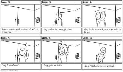
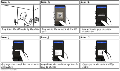
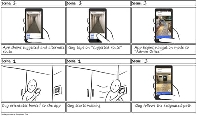
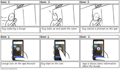
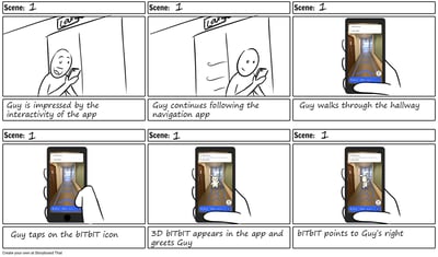
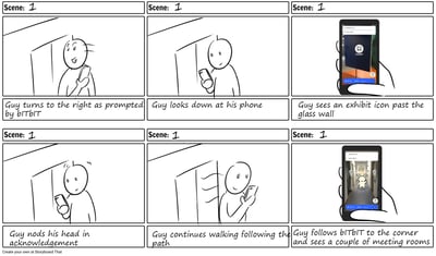
I created a storyboard for the proof-of-concept video, showcasing these essential features."
The Working Prototype
Once the storyboards were approved, we moved forward with developing a working prototype for the video. I began by designing a
low-fidelity wireframe, focusing on key features such as:
A search bar for users to find destinations
A route selection option
Prominent guiding arrows
After aligning the application’s flow with what we wanted to showcase in the video, I proceeded to create the UI assets in Unity to bring the interface to life.







The Showcase Video
After a couple weeks of development with the software engineers, we were ready to film the video. I shot the video and edited the final product.
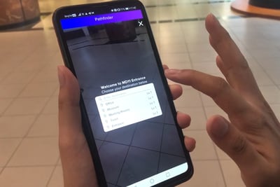
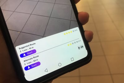
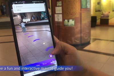
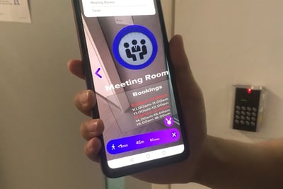
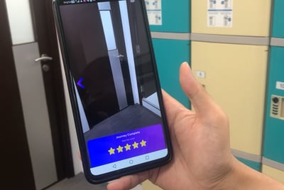
The success of the proof of concept gave us the green light to proceed with the development of Pathfinder.
With the foundational flow already in place, our focus shifted to improving the application's usability.
To begin, I refined the low-fidelity wireframe and conducted an internal user testing session with company staff. Afterward, I gathered their feedback and observations into an affinity map, prioritizing the flow and incorporating the suggestions users provided.
Medium-Fidelity Wireframe
Development
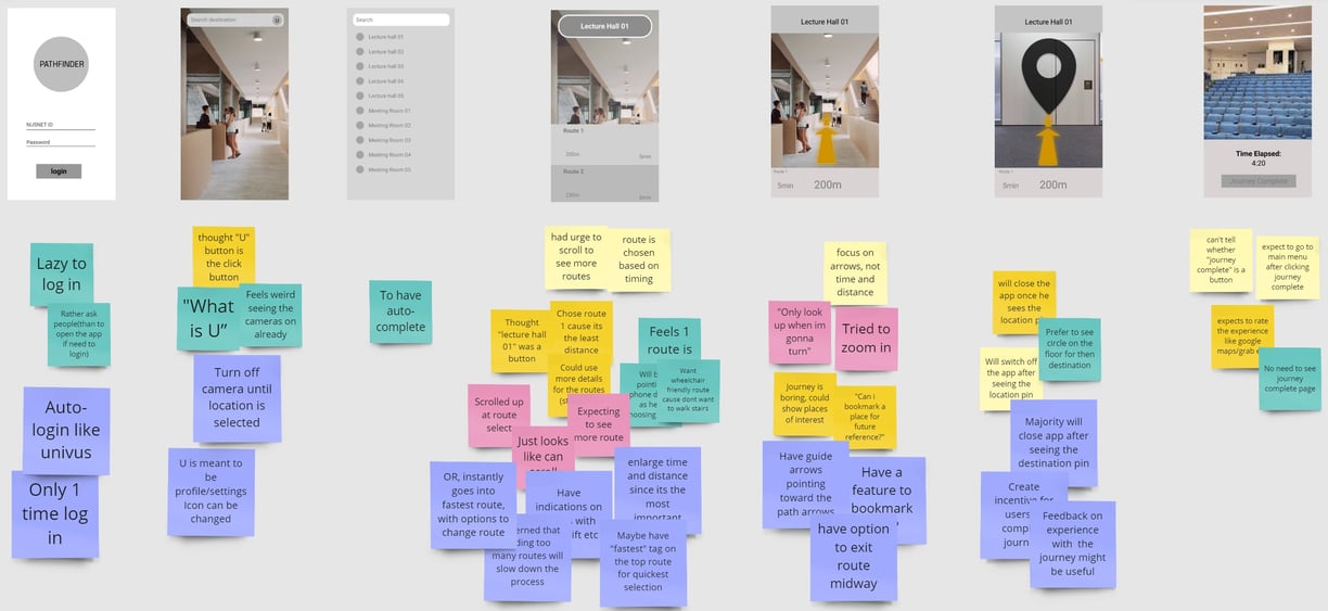
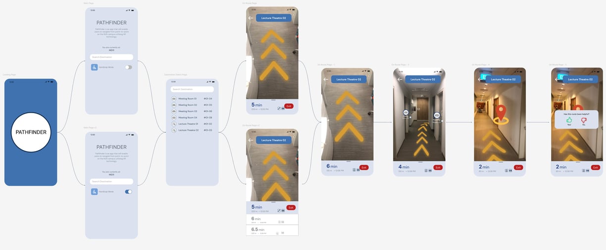

I designed the medium-fidelity prototype in Figma, focusing on refining the user flow and polishing the UI elements. I also incorporated new features based on the feedback from the previous user testing, including:
User position detection using Wi-Fi and GPS
Route options for stairs and lifts
A wheelchair-friendly mode
A rating system for users to provide feedback
I then arranged a second round of testing, selecting four users who were unfamiliar with NUS. I provided them with several scenarios and asked them to navigate through the app, encouraging them to voice their thoughts aloud while I asked questions about their expectations.
As before, I compiled the observations and feedback into an affinity map. This time, my focus was on the application's usability and the refinement of the user interface elements.


The next step was to develop the working prototype. I designed the final user interface in Figma and then brought it to life in Unity.
Meanwhile, the team invested significant time manually 3D scanning the buildings. The challenge was ensuring the buildings were scanned during low-traffic times, with consistent lighting conditions, so the scans could seamlessly stitch together.
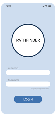
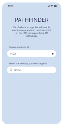
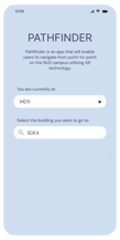
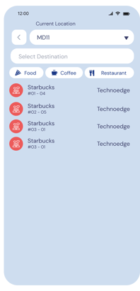
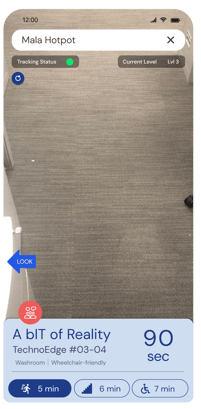
With the final design, I conducted another round of user testing, this time with participants from various profiles:
Staff aged 35-55
Staff aged 25-35
Visitors aged 25-35
Students aged 20-25
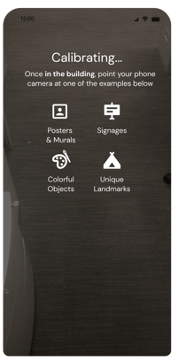
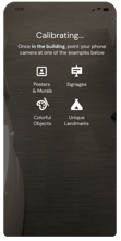
At this stage, most users found the application smooth, but many struggled with calibrating their position, leading to frustration. Their phones also intermittently lost track of their location. We identified the cause as a lack of prominent objects or landmarks in the area.
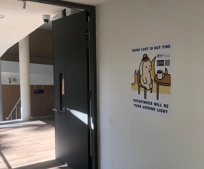
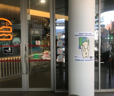
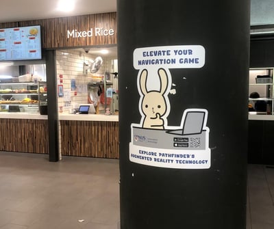
To resolve these issues, I redesigned the calibration page to make it clearer by using pictures instead of icons, helping users understand what objects to look for. Additionally, I proposed using the NUS IT mascot, bITbIT, as stickers placed around the buildings to aid in calibration.
After applying the stickers, users were able to calibrate their position much faster, and their phones maintained location tracking more reliably. The stickers also served as branding for my company, and I added a QR code for easy access to download the application for students, staff, or visitors.
